
WILDLABS Team
Overview
The WILDLABS Virtual Meetup Series is a program of webinars for community members and wider partners to discuss emerging topics in conservation technology and leverage existing community groups for virtual exchange. The aim of the series is to bring leading engineers in the tech sector together with conservation practitioners to share information, identify obstacles, and discuss how to best move forward.
Season 1 of the series took place in late 2018, covering new data collection techniques through Networked Sensors for Security and Human-Wildlife Conflict (HWC) Prevention and Next-Generation Wildlife Tracking, and effective utilization of that information through Big Data in Conservation.
Season 2 is running from April - June of 2019, exploring different models for collaboration, the low-cost tools these approaches are producing, and what we can do with the data they’re generating. The three topics being covered are Low-Cost, Open-Source Solutions, Tools and Spaces for Collaboration, and Creative Approaches to Data-Driven Storytelling.
There is a lively discussion about possible topics members would like to have space to discuss, so if you have ideas for future meetups please join the thread and share your thoughts.
Meetup 3: Creative Approaches to Data-Driven Storytelling
Date & Time
Wednesday, June 19th, 2019
3:00-4:30pm BST / 10:00-11:30am EDT
Background & Need
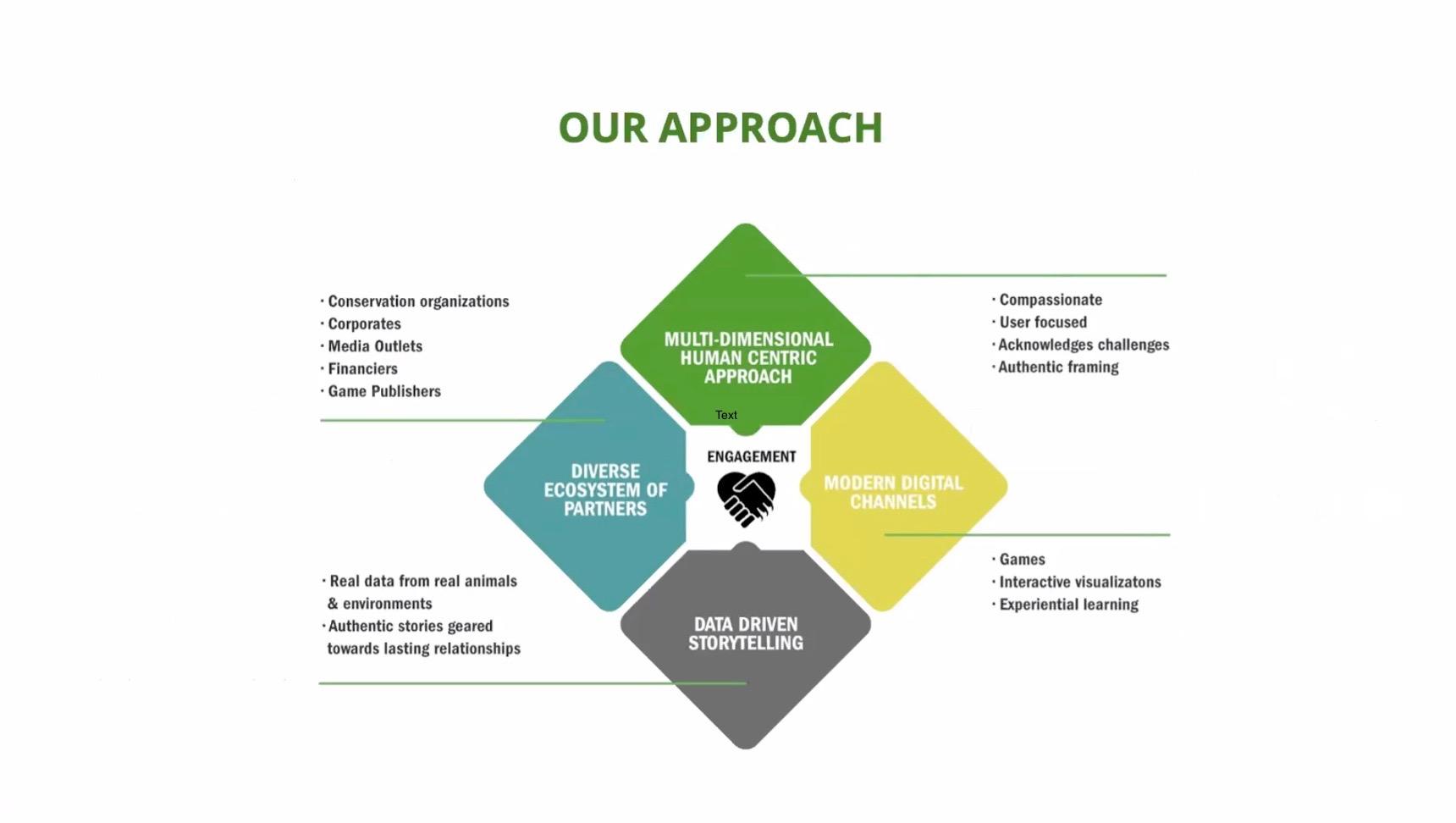
New tech developments are enabling conservation data collection on an unprecedented scale, but is getting the data enough? In our December meetup on Big Data in Conservation, we discussed how machine learning tools can help us put these massive stores of information to use. However, a major takeaway from this discussion was that actually utilizing big data often requires taking a step beyond data processing and into the realm of storytelling, which plays a critical role in closing the gap between data and decision-makers.
With so much of the focus on exciting new data collection and processing technologies, the importance of data-driven storytelling may be underestimated - our Big Data speakers and attendees agreed that this is an area in which the conservation tech community has significant room for development. There are, however, some exciting efforts leading the way. A few of these include Internet of Elephants' tools for consumer engagement with wildlife, from interactive data visualizations to social media filters and even video games; National Geographic Society's work on Vital Signs of the Planet and Earth Pulse in their Geographic Visualization Lab; and Vizzuality's beautiful data design work that enables platforms like Global Forest Watch, Global Fishing Watch, and Half-Earth.
Outcomes
The aims of this discussion are as follows: to introduce data-driven storytelling in the context of conservation tech; to describe how it is being used, including its value and place in the wider ecosystem, and how we can better take advantage of existing approaches; to identify the obstacles in advancing the capacity of these tools/approaches (e.g. lack of funding compared to more big-name tech); and to discuss its role in the future of conservation tech.
Agenda
- Welcome and introductions (5 min)
- Jason Pearson, Founder of TRUTHstudio; Founding President & CEO of the Sustainable Purchasing Leadership Council (10 min)
- Camellia Williams, Lead Writer at Vizzuality (10 min)
- Gautam Shah, Founder of Internet of Elephants; National Geographic Explorer (10 min)
- Q&A discussion with speakers (20 min)
- Optional ongoing discussion and community exchange (30 min)
- Takeaways and wrap up (5 min)
Watch the Virtual Meetup

(Click through here to watch the full meetup)
Virtual Meetup Notes
During the final event in Season 2 of the WILDLABS Virtual Meetup Series, we were joined by more than 40 attendees from around the world. Thanks to everyone who participated in the live chat and community discussion. For those of you who were unable to join live, we've recorded the session so that you may view it at your convenience. We've also shared presentation notes and further reading suggestions below.
Speaker: Gautam Shah
Background
- Worked for more than 20 years as an IT consultant with Accenture
- Left to follow passion for wildlife conservation by founding Internet of Elephants, based in Nairobi
- Internet of Elephants
- Leverages technology for public engagement with wildlife conservation
- Motivated by recognition that public engagement influences consumer markets, available finance, government policy, etc.
- Uses real scientific data about animals and their habitats
The challenge
- Conservation organizations struggle to strengthen and expand engagement to new audiences because of:
- Antiquated channels that are uninspiring and have limited reach
- Episodic campaigns that create bursts of action, but no long-term commitment or behavior change
- A focus on the organization’s needs as opposed to the needs of their audience
- Lack of cross-sector partnerships that can to help reach and engage different sectors
The opportunity
- Data: There is an enormous amount of conservation data being generated by new technologies, much of which is not being used to its full potential
- Online game engagement
- 2.6 billion people play online games worldwide
- 156 billion hours spent playing games each year
- $140 billion spent each year on games
- 1,500,000 mobile games in app stores
- Note: these numbers transcend demographic lines in age (82% of all gamers are over the age of 18), gender (52% male vs 48% female, and income levels (the majority of gamers make less than $30,000 a year), as well as geography
- Almost none of them focus on games for wildlife or nature!
The solution
- Take scientific data that has been gathered about animals and their habitats
- Create compelling and authentic conservation stories from the data
- Turn those stories into playable games and data visualizations
- Creatively distribute those products to our target audiences
Traction and products to date
- Safari Central – 2017
- App that brought 6 real animals to life in AR
- Partnered with 6 conservation organizations to tell their stories
- 100K downloads with little marketing support (primarily in emerging markets)
- Led to Fast Company Most Innovation Company 2017 Award
- Stories of the Wild – 2016
- Series of 3 emotional data visualizations from GPS data of collared elephants, lions, and wildebeest
- Award-winning example of how science, storytelling, and technology can be combined to create an appealing experience
- Satellite Stories
- Interactive visualizations of the movements of 3,000 animals over 7 days in Ol Pejeta Conservancy, Kenya
- Supported through a grant from the National Geographic Society
- Public release pending
- Wildeverse
- First full commercial game
- In partnership with the Borneo Nature Foundation and the Goualougo Triangle Ape Project in the Congo
- Like Pokémon GO but with orangutans and chimpanzees – mobile, augmented reality, location-based game that sends you on missions within your own city
- In beta-testing now, will be ready in October 2019 – quiet launch will happen then and larger public launch in US and UK will take place in spring 2020
-

What’s next
- “Run Wild” in collaboration with Runtastic/Adidas – compare your activity with real animals in the wild
- Gamified data visualization about Gorongoza National Park in collaboration with National Geographic
- Marketing activation campaign for endangered African mammals in collaboration with a mission-driven cosmetics company
- Game about mimicking animal sounds in collaboration with a major zoo
Speaker: Jason Pearson
Background
- TRUTHstudio is a strategy consultancy that focuses on the intersection between the visualization of complex information and strategic decision making
- Has worked quite a bit with WWF in this capacity
Conceptual framework
- Visualization of a system supports understanding of system relationships, which enables prioritization of leverage points, which guides action to achieve goals
- Guidelines for good graphics: see attached handout for summary
Be clear on your purpose – Is my purpose to understand or influence?
- Two main ways that visualization supports strategy
- Exploratory (analytical) – visualization is used to support our strategy – e.g. drill into a system internally to understand how it is working
- E.g. Economy Map
- An attempt to visualize the connection between economic demand and environmental impact throughout the US economy. Used large US Department of Commerce datasets merged with economic input-output lifecycle assessment datasets.
- Enables user to see which sectors are generating indirect or direct impacts on, for example, land-use change or freshwater systems
- E.g. Economy Map
- Explanatory (pedagogical) – visualization to explain to others how a system is working in order to support their strategy
- E.g. WWF’s work with the private sector, which involves helping them understand why they should take action based on what we’ve learned about key environmental impacts by sector
- Involves pulling information out of a complex model and summarizing it in a way that is accessible to colleagues in other fields/organizations
- Exploratory (analytical) – visualization is used to support our strategy – e.g. drill into a system internally to understand how it is working
Create a hierarchy of messages and information – What is the primary message? What is secondary? Tertiary?
- Visibility of information should be determined by importance. The most important information should be visible from across the room, while secondary and then tertiary information can require a closer look.
Emphasize the information (not units, labels, or axes) – Is the key data (or key message) the boldest element on the page?
- The most visually powerful part of the graphic should be the information/data itself

Match data variables to visual variables – Do multiple visual variables change when one data variable changes?
- For each of the variables in whatever you’re presenting, stay consistent throughout graphics (e.g. color always reflects country, or size always reflects volume)
Iterate, iterate, iterate (and get feedback from others!) – Have I tried other ways to represent this information?
- Try lots of different options. There are many different ways to visualize information, and it can take time to find the right one given your situation.
Create a consistent visual vocabulary in a project – Have I minimized variation of background context across diagrams?
- As you step through slides, the only thing that should change is the new information that you want to emphasize
Combine visual information wherever possible – Is there redundancy that can be eliminated?
- Have a single graphic do all of the work rather than having multiple redundant diagrams
Focus information design where it counts – Where should I invest for maximum return on understanding (ROU)?
- When budget is limited, sometimes it’s a more powerful use of funds to hire design help only for a single graphic or part of a report and keep the rest simple. All about getting the most bang for your buck.
Specify your needs, priorities, and audiences – Where do I want graphic design? Infographics? Information design?

Learn from existing examples – How have others visualized similar issues?
- There are great resources online that can help to both educate you on the science of information design and also give you examples of how others are representing information
Speaker: Camellia Williams
Background
- Vizzuality is a digital design and technology agency
- We focus on 3 main issues: Climate change, biodiversity loss, and inequality, as well as how they’re connected
- We translate data into beautiful digital products and purposeful strategies
- Our approach is informed by science, inspired by nature, and delivered with impact
Beautiful data for powerful storytelling
- Global Forest Watch
- Partnership with the World Resources Institute
- Interactive map, country dashboards, and analysis tools enable users to monitor forest loss around the world
- Design and engineering teams work closely with scientists and user researchers to balance user needs
- Impact:
- In 2015, Mongabay used Global Forest Watch data to expose the activities of a cacao plantation in Peru, which was illegally developed on forest-zoned land

- Eventually resulted in shutting down these operations using Global Forest Watch satellite imagery as evidence of the illegal activity
- More recently we used GFW to document illegal and damaging incursions of outsiders into land protected for the exclusive use of uncontacted indigenous peoples in Brazil
- Global Forest Watch’s “share” function makes it easy to share findings and use them in your own storytelling – you can do this with a bitly link to post directly on social media, or with an embed option, which enables readers to interact with the maps without leaving the site
- Global Fishing Watch
- Promoting ocean sustainability through greater transparency
- Uses cutting-edge technology to visualize, track. And share data about global fishing activity in near real-time and for free
- Impact
- Last year, Argentina created 2 new Marine Protected Areas (MPAs) with the help of a Global Fishing Watch video
- MPAs were opposed by the fishing industry because people believed it would cause thousands of job losses and harm the already unstable economy
- Using Global Fishing Watch, the supporters of the MPAs were able to show that fishing activity within the proposed sites accounted for less than 1% of Argentina’s total yearly fishing effort and that these efforts could be relocated without job losses
- This information was shared via video with members of congress, who then introduced a bill to legally establish the MPAs
Vizzuality’s approach to data-driven storytelling
- People-centered: We bring together a diverse set of skills across all stages of the project development cycle
- Allows us to combine our collective experience to understand and analyze both the data and the needs of our users, choosing the right technologies to create tools that spark curiosity and joy
- Partners: We work with partners that share our values and whose experience/ expertise are complementary to our own
- Development methodology: We make our platforms and tools agile and user-centered by developing functionality incrementally and seeking input and adapting throughout each project
- Understand what people need and why, and what tools they’re already familiar with
- Establish a clear link between use and the real-world impact we intend to have
- Our development process:
- User discovery – profile target audience
- Data discovery – assess structure, completeness, type, and format of data we’re being asked to visualize
- Scientists also look for what other data is available and if we can add more context to the data set that we’re reviewing
- Technology discovery – based on user needs and data
- We opt for open-source when possible, and publish the code on GitHub to make it accessible to others
- Design – design team gets together with the scientists, developers, and user researchers to test design options
- Data should lead design to maintain accuracy and clarity
- Once design sketches are approved, we move to development, implementation, and launch
- We maintain open channels of communication with partners throughout the process
- We adjust designs and re-build based on feedback as we go
- User testing helps to find bugs and ensure we’re meeting user needs
- Get in touch if you want to help test our tools!
What’s next?
- Research: We’re looking into the psychology of data visualization to determine if and how data visualization can change behavior – results currently in analysis, and to be shared and applied to our platforms in the future
- 3D globes: Exploring how to use these tools to engage people more deeply with data and create a personal connection with global data sets (like the Half-Earth Project)
-

-
Further Reading
Links referenced in the live chat:
- Put AR animals in your living room with Google’s Search app
- Check out this NPR story on Science Poster 2.0, which provides a modern alternative to the traditional posters scientists have been using for ages
- Learn about what kinds of stories work in today’s era of empowerment marketing in this video by Jonah Sachs
Next Steps
- Jump over to this thread to continue the conversation
- Look out for information on Season 3 of the Virtual Meetup Series this fall!
Related content
Discussion

Hi all, We're about to start the final virtual meetup of Season 2! This one will be exploring Creative Approaches to Data-Driven Storytelling. We'll...
19 June 2019
Event
WILDLABS Virtual Meetup: Low Cost, Open-Source Solutions

WILDLABS Team
The first event in Season Two of the WILDLABS Virtual Meetup Series was on Low-Cost, Open-Source Solutions. The recording is now available to watch, along with notes and recommended reading based on the discussion. In...
18 March 2019
Event
The second event in Season Two of the WILDLABS Virtual Meetup Series focused on Tools and Spaces for Collaboration. The recording is now available to watch, along with notes and suggested further reading based on the...
17 April 2019
Add the first post in this thread.